DriveTime
Car selling and buying portal
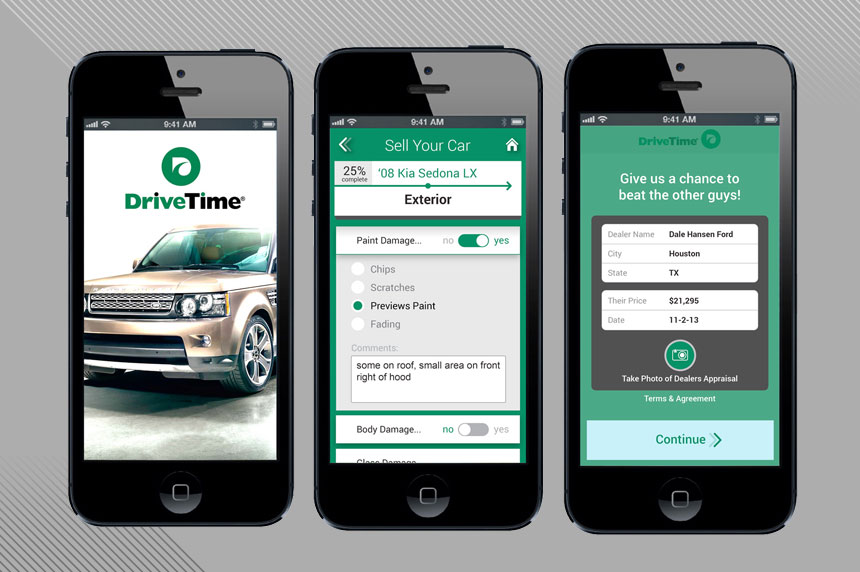
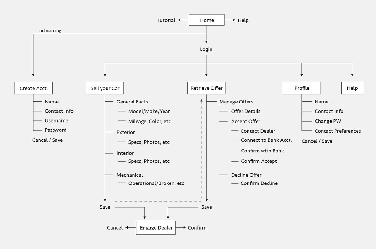
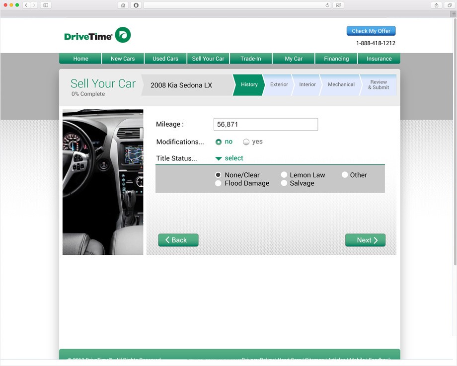
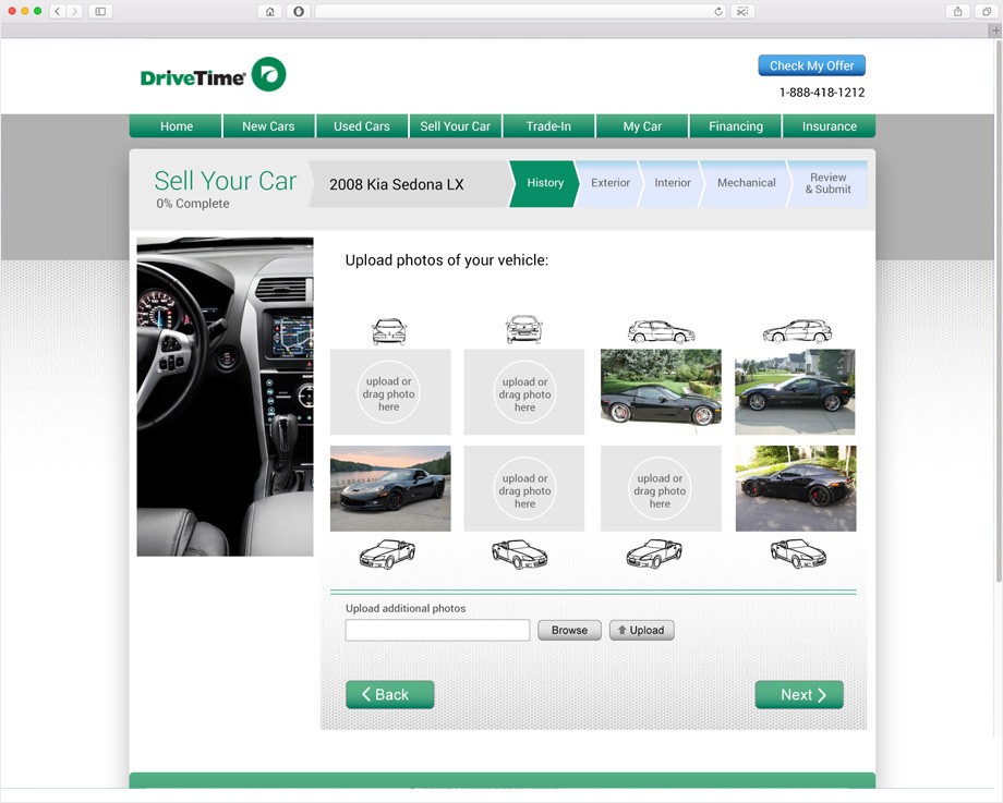
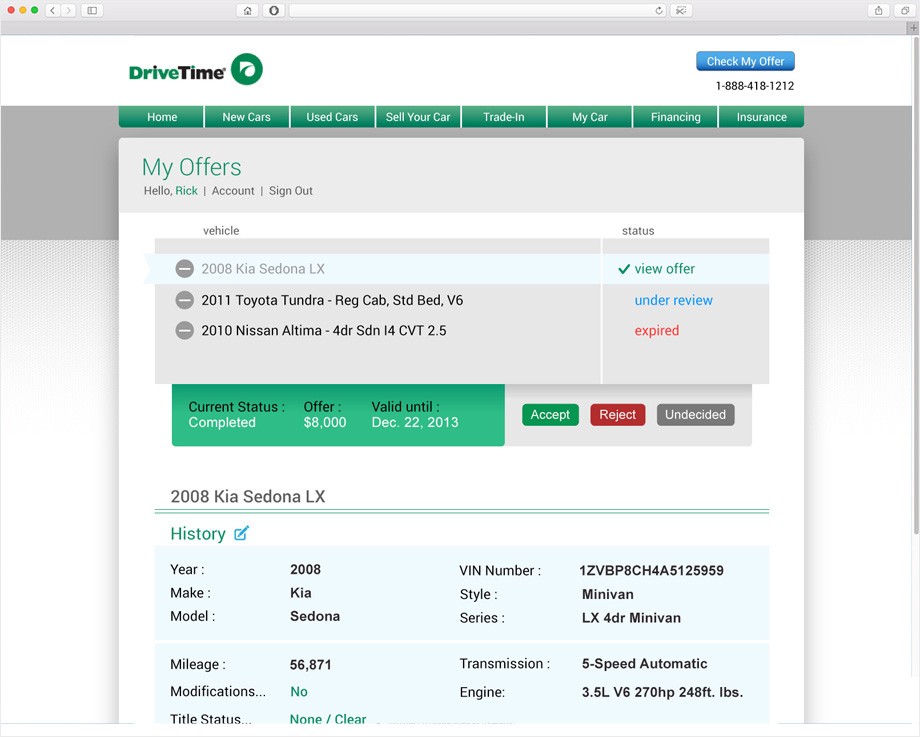
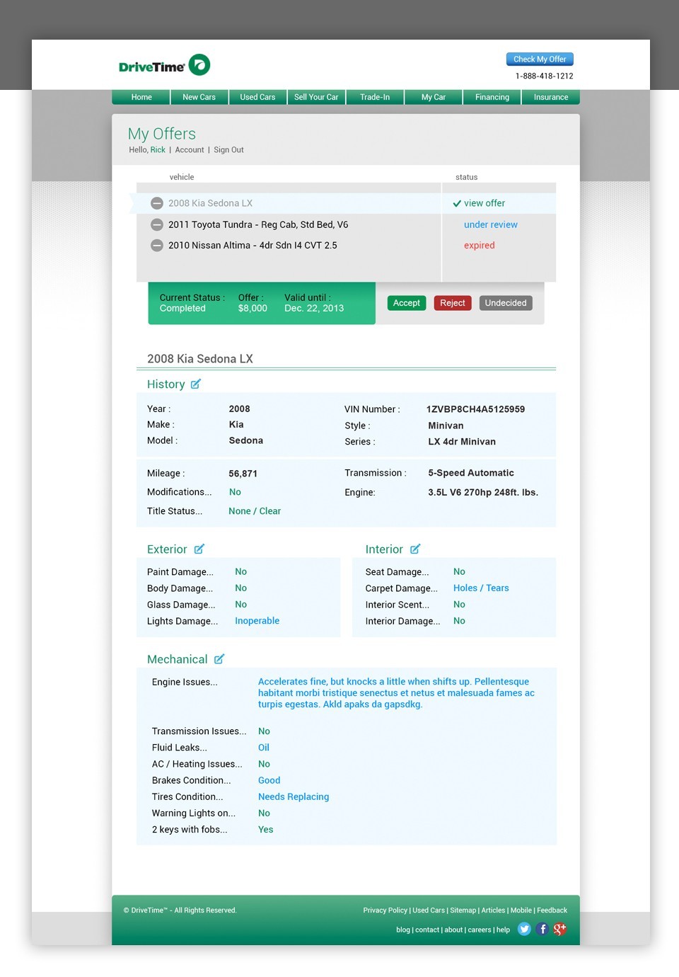
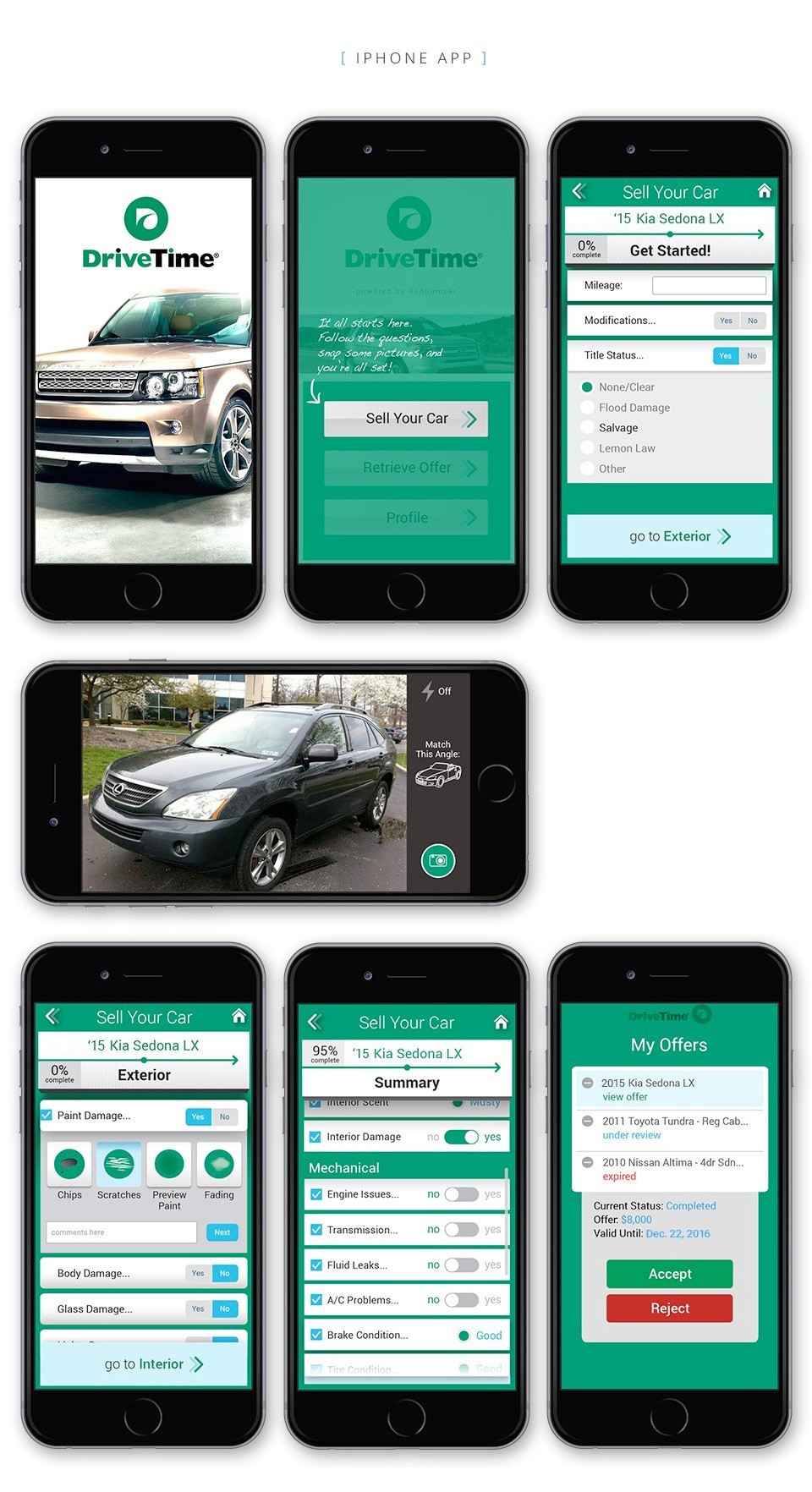
While working in tandem with Red Bumper, I worked with my PM on user research findings, defined personas, organized the information architecture into an ideal C2B user flow. DriveTime wanted to engage customers directly by way of a selling portal. A reseller program for customers to sell their vehicles back to dealers was created for mobile and desktop access.
My role
The company Red Bumper was awarded the DriveTime business for this portal. A colleague and myself were brought in to work with their PM and development team. We worked about 4 months on the project, at which point we handed it off to another smaller team for the future releases.
Activities
UX/UI lead, User Research, Wireframes, Information Architecture, Prototyping, Hi-res screens
Stakeholders
1 UX/UI Designer (me)
1 CEO
1 Project Manager
1 Technical Analyst
1 QA tester
1 Development Manager
1 Front end Developer
2 Back end Developers
Users: Apprehension & Time of Tasks
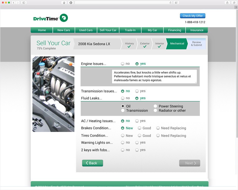
Many interviewed users, while understanding of how selling their car worked, cited “apprehension” of giving contact info and car details to a dealer, fearing being bombarded with sales people, time needed to post details, etc. We included, up-front notification modals of how the process worked, minimizing negative fears and providing more transparency of the process. We also included a progress % to show at all times how close they were to being complete with the selling flow.
Results
- Dealers had access to increased customer base via offers and direct dialog
- Customer engagement increased by 30% for first 3 months after launch
